
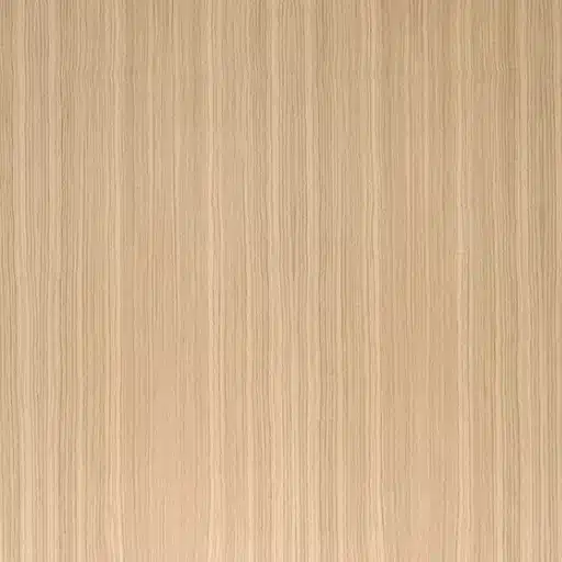
Rift Cut Veneer: Clean Lines for Modern Millwork
Rift cut veneer sits somewhere between quarter sawn and flat cut, giving you that straight, even grain without the heavy flake so many designers chase for modern cabinetry and doors. It’s the kind of cut that turns a run of office panels into something quietly expensive-looking, especially when you pair it with a light wire-brush and a satin clear coat.
What Is Rift Cut Veneer and Why Do Designers Love It?

Rift cut veneer is the cut that designers reach for when they want modern without the drama. It’s not as wild as flat-cut, not as stripy as quarter sawn—just clean, vertical grain that reads “expensive” from across the room.
How rift cutting works at the log level
Rift cutting happens at an angle, roughly 15–25 degrees off quarter, to split the growth rings rather than following them. The log gets quartered first, then sliced at that oblique angle to expose straighter, narrower ray fleck exposure and minimize the wild cathedrals you see in flat-sawn. That process yields a more uniform sheet, but it also means more waste at the mill since you’re not getting the full flitch yield of a plain-sliced log. On white oak, for instance, this gives you those tight, pencil‑like stripes instead of the big flame figure.
Yet it’s exactly that controlled slicing that keeps the grain running straight and even across a 1220×2440 mm panel. You can lay up a full door or cabinet face without the figure fighting the layout, which is why specifiers lean on it for long vertical runs.
The signature “straight, quiet” grain pattern
The hallmark is grain that’s vertical, tight, and understated. Think subtle rays and fine linear figure that feels almost architectural, like the texture of a good linen weave but in wood. On walnut or ash, it’s even more restrained, giving a modern loft or office the kind of warmth that doesn’t compete with the furniture or art.
Designers love it because it’s versatile without being boring. You can slip‑match it for a subtle rhythm across panels, or book‑match for a bit more movement on a feature wall, and it still looks intentional. In a hotel lobby with 47 identical doors, that consistency keeps the whole space feeling cohesive instead of patchy.
Rift Cut vs Quartered vs Plain Sliced: What Actually Changes?

Rift cut veneer splits the difference between the drama of plain sliced and the severity of quartered, giving you straight grain without the wild figure or heavy ray fleck. The real question is which cut serves your layout best.
Visual differences on doors, panels, and drawer fronts
Plain sliced is all about the cathedral. Big, swooping grain that draws the eye across a drawer front or cabinet door, perfect when you want movement and warmth on a kitchen island end panel. Rift cut tightens that up—straight, linear figure like tight pinstripes, so a 2134 mm tall wardrobe door reads clean and vertical instead of wavy. Quarter sawn goes even straighter, with those bold ray flecks adding texture you can see from 4 meters away.
On panels, the difference hits hardest. Plain sliced book-matches into mirrored flames that feel traditional; rift cut slip-matches into subtle repeats that look almost man-made in their restraint. Drawer fronts show it too: rift’s even grain makes a 16-drawer bank feel like a single piece, while quartered might fight the hardware with too much contrast.
Movement, stability, and panel layup implications
Rift cut behaves somewhere between the two. Quarter sawn resists cupping best because the growth rings run closest to 90 degrees to the face, but it’s stiff and can feel “locked” in layup. Plain sliced moves more across the grain, so you plan your core and crossbands accordingly. Rift cut gives decent stability—better than plain sliced on a 1220 mm wide panel—without the quarter sawn premium.
Layup matters at scale. For a run of 28 hotel room doors, rift’s forgiving grain direction means less fiddling with flitch orientation; you can cut centers and edges from adjacent leaves and still get visual flow. Plain sliced demands more careful flitch management to avoid mismatched cathedrals.
Where each cut makes the most sense in a project
Plain sliced owns traditional kitchens and furniture where the grain tells a story. Use it on raised panels or end grain uppers where you want warmth and figure. Rift cut fits sleek, modern millwork—corporate offices, lofts, contemporary baths—anywhere vertical lines and subtle texture support the architecture without stealing focus.
Quarter sawn is your go-to for mission-style or high-contrast craftsman work, or when stability trumps all on big slabs. But it’s overkill on hidden carcasses or budget runs. Pick based on the room’s mood, not the spec sheet. You’d notice the wrong cut most when the doors line up under strong light.
3 Key Decisions When Specifying Rift Cut Veneer

Specifying rift cut veneer comes down to species, matching, and substrate—get those right and your panels will look like they belong in a high-end showroom. Mess them up and you’re just buying expensive sheetrock.
Species choices: oak, walnut, and others
White oak is the rift cut poster child. Its tight, linear grain and subtle ray flecks give that clean, modern vibe architects love for corporate offices or urban kitchens, without the heavy flake of quarter sawn. Walnut runs a close second—darker, more subdued figure that reads sophisticated on media walls or hotel headboards, especially with a light gray toner.
Ash and maple fill other slots. Rift cut ash brings a bright, almost bleached look that pairs with matte whites in contemporary baths, while hard rock maple’s near-white tone works where you need crisp contrast against dark frames. Each species shifts the mood a bit. Oak demands attention; walnut whispers it.
Matching options: slip, book, and random match
Slip matching keeps it simple. Adjacent leaves side by side create subtle vertical repeats across a door or panel field—perfect for long runs of 19 cabinets where you want rhythm without mirror-image drama. Book matching flips every other leaf for a more dynamic flow, like gentle waves running up a 2.4-meter feature wall.
Random match is the wildcard. Great for breaking up big expanses or when flitch yield forces variety, but it can look busy if the grain character varies too much leaf to leaf. For 36 identical conference room doors, stick to slip—consistency trumps flair.
Substrate, core, and thickness considerations
Pair rift cut veneer with a quality core. Baltic birch plywood breathes with the veneer, minimizing telegraphing on a 1524×2438 mm panel; MDF gives dead-flat faces but can feel lifeless under thin skins. Particleboard splits the difference on cost but watch for edge blowout during layup.
Thickness depends on the end game. 0.6 mm holds up fine for cabinets and casegoods; drop to 0.5 mm for curves or tight radii. On tall wardrobe doors, you’d notice the difference in durability after a year of sliding hardware wear. So spec based on exposure, not just budget.
Where Rift Cut Veneer Shines in Real Projects
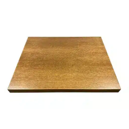
Rift cut veneer turns good architecture into great interiors when you let its vertical grain reinforce the lines already there. It’s less about stealing focus and more about making the whole room feel taller, cleaner.
Kitchens and built-ins with strong vertical lines
Shaker-style uppers and slab fronts love rift cut. That straight grain runs uninterrupted from toe kick to crown, making a narrow galley feel less like a tunnel—especially on white oak with a light cerused finish. In a 3.7-meter island with vertical stiles, rift cut walnut keeps the whole run reading as one piece instead of eight mismatched doors.
Built-ins get the same boost. Floor-to-ceiling media walls or pantry towers gain gravitas when the grain ladders up without cathedrals breaking the flow. You’d notice it most stepping back from a ladder: plain sliced fights the height; rift cut embraces it.
Office, hospitality, and multifamily millwork
Corporate lobbies and conference rooms lean on rift cut oak or ash for reception desks and credenzas. The subdued figure doesn’t compete with branding graphics or video walls, yet it feels substantial enough for client meetings. In a 42-story office tower I worked on, rift slip-matched panels lined every lift lobby—consistent, understated, and zero visual fatigue across 17 floors.
Hospitality follows suit. Hotel room vanities and bar fronts use rift cut to deliver luxury without busyness; multifamily corridors and mailroom cabinetry get the clean lines without the maintenance of figured wood.
Feature walls, doors, and large run panels
Feature walls are rift cut’s showcase. A 4.2 x 2.7-meter media backdrop in slip-matched rift walnut draws the eye without overwhelming the seating; book-matched adds subtle rhythm for boardrooms. Doors—especially tall wardrobe or pocket sliders—benefit too, with grain that doesn’t warp visually across a 2340 mm height.
Large run panels demand it. When you’re veneering 27 identical office divider screens, rift’s repeatable grain keeps batch-to-batch matching invisible. Plain sliced would show every flitch change under fluorescents.
Finishing Rift Cut Veneer Without Losing the Grain
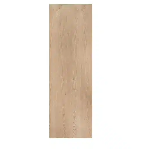
Rift cut veneer begs for finishes that let the grain lead. Bury it under heavy pigment or gloss and you’ve wasted the cut’s clean lines.
Clear, natural, and light-toned finishes
Clear finishes are rift cut’s best friend. A good UV-cured catalyzed lacquer or waterborne poly brings out the subtle ray texture without yellowing over time, keeping white oak bright and walnut rich. On a rift cut ash vanity, you’d notice how the clear satin amplifies the near-white tone, making it pop against matte black hardware.
Light-toned options like gray ceruse or white wash add modern edge. Ceruse fills the ray flecks on oak just enough to highlight them, turning a subtle grain into quiet drama. Natural oils work too—tung or Danish oil—for casegoods that need hand-feel, but they demand regular maintenance.
Dealing with color variation and end-matching
Color shift leaf to leaf is rift cut’s quirk. Adjacent sheets might lean warm or cool by a full shade, so test your finish on a full door mockup before committing the run. Slip matching hides it best; book matching can amplify the contrast if you’re not careful.
End-matching is where pros earn it. On a 2.1-meter wardrobe door, feather the joint with a light toner wash so the grain flows across the stile without a hard stop. That little step keeps the eye moving up instead of stalling at the seam.
Sheen levels and how “modern” they read
Satin or matte sheens scream contemporary. Gloss on rift cut feels like a mistake—it turns subtle grain into a shiny distraction, like pinstripes on a disco ball. Satin (20–35% sheen) lets light dance across the rays without glare, perfect for office panels or kitchen islands.
Matte under 10% pushes full modern, especially on larger walls. But it shows fingerprints and scuffs more, so reserve it for low-touch features. You can always bump to eggshell later if the client wants a bit more protection without losing that velvety look.
Frequently Asked Questions (FAQ)
-
What makes rift cut veneer different from quarter sawn on white oak doors?
Rift cut slices at a 15-degree angle to the growth rings, giving straight grain without the heavy ray flecks you see in quarter sawn. Quarter shows bold, shiny stripes across a 2134 mm door; rift stays linear and subtle. For a modern office run, rift hides leaf variation better under LED lights. -
Is rift cut veneer more stable for large wardrobe panels?
Yes, somewhat. It splits the difference—better cup resistance than flat cut, less rigid than full quarter. On a 1220×2440 mm panel over Baltic birch, rift cut minimized telegraphing during seasonal humidity shifts in a Chicago condo tower. Still, crossbanding matters more than cut alone. -
Can I stain rift cut veneer the same as flat cut oak?
You can, but expect subtle differences. Rift’s tighter grain takes dye more evenly, so a medium gray toner on white oak reads cleaner without blotching. Test on a full door mockup first—a hotel client once rejected flat cut because the cathedrals pulled too dark at the centers. -
What’s the best matching for rift cut on kitchen cabinets?
Slip matching. Lay leaves side-by-side for vertical rhythm across uppers and a 3-meter island. Book match adds wave if you want drama on end panels. In a 19-piece galley, slip kept the grain flowing like a single tall sheet instead of 4 mismatched doors. -
Does rift cut veneer work on curved furniture?
It does at 0.5 mm thickness. The straight grain wraps a 127 mm radius console leg without checking, unlike figured flat cut. Flex it dry first over your form; a rift walnut media cabinet I spec’d held the curve perfectly under satin lacquer.
References
-
Purdue University Extension. (n.d.). Manufacturing Fine Hardwood Face Veneers (FNR-240). https://www.extension.purdue.edu/extmedia/fnr/fnr-240.pdf
-
American Hardwood Export Council (AHEC). (2019). Veneer Technical Guide. https://www.hardwoodweb.com/wp-content/uploads/2019/11/veneer-technical-guide-19.pdf
-
Conspectus Inc. (2012). Tech Tips C1030: Quarter and Rift Wood Cuts. https://www.conspectusinc.com/hubfs/Conspectus-Tech-Tips-C1030-Quarter-and-Rift-Wood-Cuts-12.04.01.pdf