
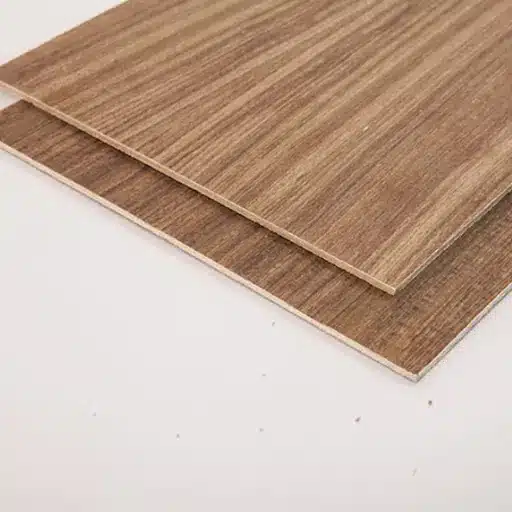
Fancy Plywood: How Pros Actually Choose It
Let’s be honest, most clients just point at a finish and say “I want this look,” and you’re the one who has to make it work on site. Fancy plywood is what you reach for when plain commercial boards won’t cut it visually, but you still need something that machines cleanly, holds hardware, and survives the daily abuse of doors slamming, kids climbing, and cleaners wiping everything down.
3 core decisions that define fancy plywood (beyond the catalog name)
You don’t get “fancy” just because the brochure says so. It’s those three quiet choices under the surface—core, face, and finish—that decide whether a sheet behaves like a premium board or fights you at every step.
1) Core type and stability for machining and hardware
If the core moves, everything else is lipstick. The core decides how your fancy plywood sits on the saw, how clean your edges are, and whether hinges stay aligned after a couple of seasons. A decent calibrated core lets you rip 448 mm wardrobe sides all day without your carpenter swearing at thickness variation.
So you look at stability and screw‑holding together, not in isolation. A denser hardwood or combi core will usually give you better grip for hinges and bed fittings, but you know it’ll also feel heavier on site. For high‑end furniture that will be opened and closed a few dozen times a day—hotel wardrobes, kitchen wall units above head height—that trade‑off is often worth it. On long runs of paneling where weight matters more than screw pull‑out, a lighter, well‑made core can be the better call.
Stability also shows up in how the board responds to routing and edge profiling. A good core lets you run a 2 mm radius on exposed edges without chunks tearing out or random voids showing their face. That’s where you really see the difference between a true fancy plywood panel and a slapped‑together decorative sheet with pretty paper on top.
2) Decorative face: veneer species, textures, prints
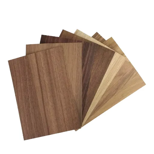
The face is what the client falls in love with, but you’re the one who has to manage it. “Fancy” usually means a more controlled, consistent, or expressive face—ranging from straight‑grain engineered oak that stays uniform over 37 doors, to bold walnut or ash patterns that need proper matching so the lobby doesn’t look chaotic.
Natural veneer on fancy plywood gives you depth and chatoyance that printed paper just can’t fake. You see it when light grazes the surface at 4 p.m. and the grain seems to shift. But it also brings real‑world issues: sequence matching, shade variation, and the odd pin knot you have to plan around. Engineered or reconstituted veneers sacrifice a bit of that natural drama, yet they pay you back in consistency, especially on large commercial jobs where an extra 11–13% waste on natural veneer is not unusual once you reject off‑shade or badly figured leaves.
Then you’ve got textures and prints—brushed, pore‑filled, synchronized emboss, concrete or fabric looks. These live or die on edge treatment and panel layout. A heavily textured face looks fantastic on wardrobe shutters but might drive you mad on tight, mitred TV units where edges have to line up almost perfectly or every mismatch shouts at you from across the room. So the “fancy” choice isn’t just species; it’s how that surface behaves at scale.
3) Factory finish vs raw surface for on‑site polish
The third decision is how much finishing you want the factory to do for you. Pre‑finished fancy plywood can save enormous time on projects where you’re racing handover dates and don’t want painters camping on site for two extra weeks. You pull the sheets, edge, assemble, touch up—done. On repetitive runs, like 96 identical room doors, that predictability is gold.
Raw surfaces, though, are still the default for a lot of shops that care about custom color, repairability, and blending with existing millwork. You can stain, tone, and clear‑coat to match an older batch or an architect’s sample that’s just a bit off from anything standard. You also get more room to fix small handling marks; a light sand and another coat usually hides sins that would ruin a factory UV finish.
There’s a middle ground you probably lean on more than you admit: boards with a sealer or primer coat that stabilize absorption but still expect a final finish from your side. Think of it as training wheels for the finishing schedule—less risk of patchy stain, better control of sheen, fewer surprises when you spray the last batch at 7 p.m. after a long day. In the end, with fancy plywood, those three choices—core, face, finish—are where the real specification happens; the catalog name is just the label on the box.
Where fancy plywood belongs in your project – and where it’s overkill
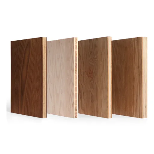
Fancy plywood earns its keep where people see and touch the surface every day, not on the hidden carcass that just holds everything up. Use it where the finish sells the job, and save your budget where nobody will ever notice the upgrade.
Wardrobes, TV units, and bedroom furniture runs
Bedrooms are where fancy plywood quietly does its best work. Wardrobe shutters, visible side panels, headboard backers, and the full‑height TV wall are all prime areas where a nicer face and stable core actually change how the space feels. Put a straight‑grain engineered oak or walnut face on those large planes and even a compact 11–12 ft room suddenly looks more intentional instead of “modular by the meter.”
On long furniture runs, consistency starts to matter more than anything. If you’re doing 26 wardrobe units across an apartment block, a decorative range that holds color and grain direction sheet after sheet saves you from that awkward moment when two shutters side by side are half a shade off and the owner spots it instantly under warm LEDs. That’s where fancy plywood, with controlled veneer or print selection and proper calibration, justifies its extra cost because you lose less to rejection, rework, and on‑site arguing.
You can still be smart about where you stop. Use the premium decorative face on shutters, visible end panels, and open niches, then drop to a good commercial or calibrated board for internal shelves and unseen partitions. Nobody is opening a drawer to admire the inside of the carcass, they’re judging the fronts and the way light plays on the grain when they walk into the room. So let fancy plywood carry the visual load, not the entire box.
Kitchens, vanities, and other high‑humidity zones
Kitchens and vanities are trickier. They’re exactly where clients want that “fancy” look, but they’re also where steam, cleaning chemicals, and sloppy usage try to kill your nice finish over time. You can absolutely use fancy plywood on shutters and exposed panels here, but then you need to be deliberate about the core, bond class, and finishing system, not just the pattern on the face.
In sink areas, dishwashers, and under‑counter zones that see regular moisture, the board’s glue line and edge sealing matter more than whether the surface looks like premium oak or a concrete texture. Fancy plywood with a suitable moisture‑resistant or boiling‑water‑resistant bond, well‑sealed edges, and a robust topcoat can hold up fine, but if the client won’t pay for proper finishing and hardware, you’re often better mixing materials—fancy plywood for visible facias, something more forgiving for boxes and backs. Think of it like specifying a nice stone countertop but still respecting the substrate and support; the pretty part doesn’t save you if the structure fails.
For vanities and bathrooms, you’d usually tighten the spec even more. Smaller spaces, more concentrated moisture, casual use. If you’re going to bring fancy plywood into that environment, keep it to fronts and decorative panels you can fully seal on all sides, and be realistic: sometimes a good quality plain board with a high‑pressure laminate is the more honest choice behind the mirror cabinet. Fancy plywood is a tool, not a religion—use it where its look and feel earn you trust and repeat work, and don’t be sentimental about dropping back to simpler materials when the environment is actively hostile.
Reading a fancy plywood spec like a buyer, not a brochure
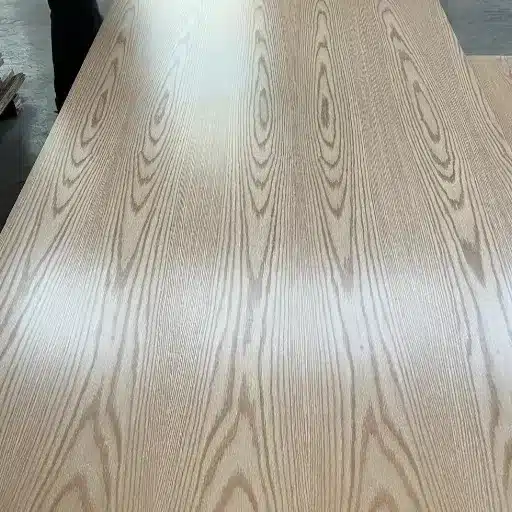
If you read the spec the way a catalog wants you to, almost every board looks good. Read it like a buyer who has to live with callbacks and site complaints, and fancy plywood starts to separate into “safe bet” and “don’t touch this on a deadline.”
Thickness, calibration, and density numbers that actually matter
Thickness isn’t just “18 mm” on paper. What you really care about is the tolerance around that number and whether the board is genuinely calibrated across the sheet. If you’re running a 3.2 mm groove for the back or using confirmats and minifix on a CNC, that extra 0.6–0.8 mm variation between sheets shows up immediately as misaligned hardware and doors that never sit quite right.
So you look for tight thickness tolerances and some mention of calibration, not just a nominal size. On wardrobe runs, for example, if you’re batching 40‑plus carcasses, even a consistent 17.6 mm that’s properly calibrated is easier to work with than a “true 18 mm” that wanders from edge to center. Density is the other half of that story. A board in a sensible range for the application feels predictable on the saw—your cutters stay sharper longer, edges don’t crumble when you put a 2 mm PVC edge, and screws bite without that spongy feeling you get from under‑spec cores.
You’ll also notice density in how the panels behave once they’re up. A slightly denser core on tall shutters helps reduce that hollow drum sound when someone knocks on the door, and it gives hinges a bit more bite over time. Too heavy and your installer starts cursing you on site; too light and you’re back fixing sagging or rattling panels six months in. There’s a sweet spot, and you can feel it after you’ve handled a few hundred sheets.
Glue and bonding class (MR, BWR, BWP) in different room conditions
The bonding class is where the fancy surface either survives or quietly fails behind the scenes. MR (moisture resistant) can be perfectly fine in a dry bedroom with decent ventilation, but in a compact city kitchen with a constantly used kettle and no chimney, you’re asking a lot from the glue line if you stay at the lowest spec. BWR or BWP gives you a bigger safety margin when those edges inevitably see a bit of water or steam.
So you match bond class to the room, not to the marketing story. Bedroom wardrobes, TV units, study furniture—MR is typically enough if the rest of the construction is sensible and edges are properly sealed. For kitchens, vanities, utility rooms, or anywhere there’s regular damp cleaning and steam, stepping up to BWR or BWP on fancy plywood shutters and exposed panels is just cheap insurance. It’s not that every drop of water will suddenly delaminate an MR board; it’s that once swelling starts at an edge, the prettiest veneer or print can’t hide the damage.
There’s also the question of what the spec doesn’t say. If a “premium decorative plywood” avoids clearly stating MR/BWR/BWP or equivalent standard, that’s a flag. A serious supplier will usually align to some recognizable classification or standard, because they know you’re going to put this stuff in service environments where failure is visible and expensive. When in doubt, ask them flat out where they’d use that board in their own house. The pause before the answer tells you plenty.
Face grade, matching options, and color consistency across sheets
The surface is where clients judge you, so the face spec matters more than one line in the brochure. Face grade tells you how many patches, knots, or repairs are acceptable, and on fancy plywood those decisions show up very clearly on wide shutters and long wall panels. Even one odd patch at eye level on a main wardrobe can ruin the look of an otherwise well‑built unit.
Matching options—book, slip, sequence—are what keep large surfaces from looking chaotic. If you’re doing a 4.8 m TV wall in a straight‑grain walnut look, you want a spec that actually allows you to keep the grain flowing in a believable direction rather than changing character every 600 mm. That’s where you check if the supplier can offer sequence‑matched sets or at least consistent pattern repeats, especially on engineered or printed faces. When you get 17 doors out of a batch that look related instead of like cousins twice removed, you feel the difference.
Color consistency across sheets is the quiet killer of “fancy” jobs. Under showroom lights, a slightly warmer batch and a slightly cooler batch seem acceptable; under warm white LEDs at home, that half‑step difference jumps out every time someone walks into the room. So you check how the range is controlled—whether it’s natural veneer sorted into ranges or a printed design with tight production control—and you plan for a bit of extra material on jobs where alignment and continuity matter.
When decorative boards fail on site (and why it happens)
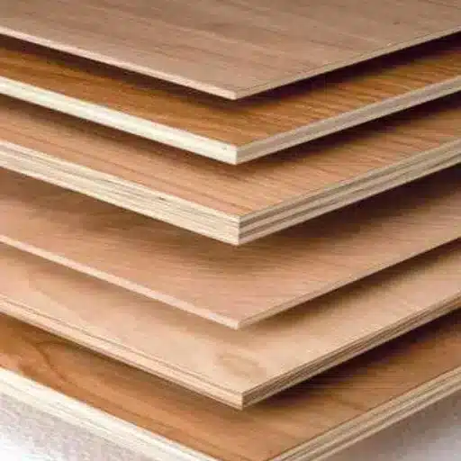
Every installer has that job they’d rather forget—the one where everything looked fine leaving the workshop, and three months later the client is sending photos of swollen doors and weird shadows on the panels. Fancy plywood doesn’t magically avoid those failures; if anything, the decorative surface just makes them more obvious.
Warping, bubbling, edge failures, and shade variation
Warping is usually the first insult. A tall shutter that was dead straight on the trestle suddenly has a 4–6 mm bow once it’s hung, and you’re back on site tweaking hinges and blaming humidity under your breath. Most of the time it’s uneven moisture and an under‑spec core: one face picks up or loses moisture faster than the other, the glue line can’t keep stresses balanced, and the panel moves while the hardware tries to hold it flat. Stack that with poor storage—leaned against a wall, bottom edge sitting on a damp floor for a week—and even a decent board will start to misbehave.
Bubbling is the one that really kills the “fancy” part. You’ll see a small blister near a sink, a dishwasher, or along a horizontal edge where water sits just a bit longer than it should. Under that bubble is either a weak glue line or exposed edge that’s been wicking moisture, so the decorative face or veneer lifts locally while the rest of the sheet stays bonded. Once you can feel that little pillow under your fingers, you’re not “repairing” it in any convincing way; you’re cutting and replacing, and the client doesn’t care whether it was the bond class, the carpenter, or the cleaning staff who caused it.
Edges are where most failures actually start, even if the surface gets the blame. A fancy plywood shutter with a good face but poorly sealed edges is like a raincoat with the seams left open—water finds the gap first. You’ll see swelling at the bottom of bathroom doors, chipping under handles where people grab and pull, or hairline cracks along machine‑routed profiles where the core was too soft. Once that edge has puffed up by even 1–2 mm, your perfectly aligned reveals start to look sloppy and the whole unit suddenly feels “cheap” to the person using it.
Shade variation is the quieter failure, but just as painful. Two sheets from different batches, or even different parts of the same log, end up side by side on a long wardrobe run and you get that half‑tone shift that you notice every single time you switch on the lights. On natural veneers, that’s often poor sorting or not ordering enough extra to control layout; on printed or engineered faces, it can be batch drift or a supplier who treats color tolerance loosely. Either way, the client doesn’t see “natural variation” or “production tolerance”—they see one odd door in a set of eleven and wonder why it doesn’t match.
Most of these problems don’t show up in the brochure. They show up at 7:30 p.m., when the site lights are harsh, the handover date is tomorrow, and you’re staring at a warped shutter or a bubbled panel trying to decide whether to push it through or rip it out and start again. That’s why reading past the “fancy” label and respecting storage, edges, and batch control matters more than any marketing name printed on the sheet.
Before you sign the PO: a short, no‑nonsense checklist
If the questions are sharp before the PO, the project is boring after installation—in a good way. Treat fancy plywood like hardware: you interrogate it a bit before trusting it on a big job.
Simple inspections when pallets land in your workshop
When the boards arrive, you’re not doing lab testing. You’re doing fast, dirty, effective checks. Pop the straps on one pallet, pull 3–5 random sheets—not just the top one—and check thickness with a caliper at center and corners. If you’re seeing more than about 0.6–0.8 mm swing on something sold as “calibrated,” that’s going to bite you on machinery and fitting.
Stand a couple of sheets on edge and sight down the length. Mild camber you can live with; visible twist or a “banana” profile on a fresh delivery is a bad sign before you’ve even started edge banding. Run your hand across the face under raking light; you’ll feel ripples, sanding marks, or telegraphing from a rough core long before a client ever sees it installed.
Then look at color and pattern across multiple sheets laid side by side. You don’t need a color meter here, just your eyes. If three out of seven sheets feel like they belong to a different family, you either break them into separate zones on the project or you start talking to the supplier immediately, before anything hits the saw. It’s much easier to argue over a full pallet than over offcuts.
Red flags that should make you change the brand or spec
Some warning signs show up even before delivery. If the supplier won’t commit to a bond class, can’t name the finish type, or dodges direct questions about core construction with marketing adjectives, treat that as a big hint to walk away. “Premium quality” without numbers is decoration, not data.
On site, the red flags get louder. Edges that crumble when you do a light profiling pass, faces that chip badly even with a sharp blade and correct feed, or a finish that scratches with a fingernail are all signals that this batch—or sometimes the entire line—isn’t what you need for serious work. If you start seeing early bubbling near sink cutouts or dishwashers on a supposedly moisture‑resistant product, don’t wait for the full set to fail; stop, document, and push the issue while you still have untouched sheets in the stack.
The real discipline is this: after one bad batch with the same pattern of problems, you change something on purpose. Either you move up to a better line in the same brand, change the spec to a different product that matches the environment better, or you switch brands outright instead of trying to “work around” a material that keeps fighting you. Fancy plywood should make your work look better and go faster, not become the recurring character in every punch‑list meeting.
Frequently Asked Questions (FAQ)
-
Is fancy plywood actually better than using plain ply with laminate for wardrobes?
Fancy plywood makes more sense when you want a cleaner, more “one‑piece” look and consistent edges, especially on open niches and full‑height shutters. With laminate on plain ply, you’re managing two materials, more joints, and more chances for edge chipping. On a 12‑door wardrobe run, a good fancy plywood can save you time on pressing and trimming while keeping the grain flow more controlled. -
Can I use fancy plywood for kitchen shutters near the sink and stove?
You can, but only if the bond class, edges, and finish match the abuse level. For sink‑side shutters, you’d want at least an MR board with properly sealed edges, preferably BWR/BWP if the client is splash‑happy and cleaners are rough. I’d keep fancy plywood to visible shutters and panels, then run a tougher, cheaper core for internal boxes and hidden dividers to keep the budget sane. -
How do I check if a fancy plywood sheet is calibrated properly before cutting?
Grab a caliper and measure thickness at 5–7 random points—four corners, center, maybe a couple along the long edge. If an “18 mm” sheet is wandering between, say, 17.1 and 18.4, you’ll fight grooves, hinges, and drawer fittings. Lay two sheets flat, face to face, and feel for rocking; on a well‑calibrated batch, they sit almost dead flat on each other. -
Will fancy plywood doors warp more than normal plywood doors?
Warping is about core quality, moisture balance, and storage, not the word “fancy” on the label. A properly balanced fancy plywood shutter, stored flat and sealed on all sides, will behave as well as any good calibrated ply. The problems come when only the face is upgraded but the core is cheap; that’s when you hang a 7‑foot door and see a 4–5 mm bow by the time snagging starts. -
What thickness of fancy plywood should I pick for a wall‑mounted TV unit?
For a typical 1.8–2.1 m wide wall unit, 18 mm fancy plywood on visible carcass and shutters is a comfortable default, with 9–12 mm backs depending on the load. If the client wants deep drawers under the TV and heavy storage, I’d stay with 18 mm on structural members and maybe go for a slightly denser core. On purely decorative fluted or slatted facias, 12 mm can work fine to keep weight down.
References
-
Hardwood Plywood & Veneer Association (HPVA). (n.d.). Preventing Checking and Warping in Wood Veneered Panels. https://www.murphyplywood.com/pdfs/hardwood/HPVA_Preventing_Warping_Checking.pdf
-
Vital Wood Global. (2025). Plywood Manufacturer: Commercial, Marine & Fancy Plywood Factory. https://vitalwoodglobal.com/plywood/
-
Vital Wood Global. (2025). Premium Wood Veneer Sheets for Every Project. https://vitalwoodglobal.com/wood-veneer/