

Burl Veneer: How Pros Actually Choose and Use It
Most people only think about burl veneer when they want something that looks expensive without shouting about it. You’re not just picking a pretty sheet of wood; you’re gambling on yield, stability, and whether that wild figure will still look controlled once it’s pressed and finished. The difference between a piece that feels custom and one that feels chaotic usually comes down to a handful of quiet decisions you make long before glue ever hits the substrate.
What Makes Burl Veneer Different From “Normal” Veneer?
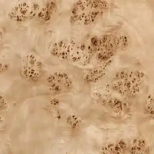
How burl figure forms in the tree
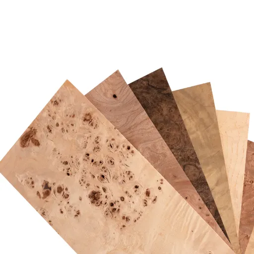
Burl veneer is what you get when a tree grows wrong in all the right ways. Instead of long, straight grain, a burl is a dense mass of bud tissue and distorted fibers where the tree has responded to stress, injury, fungus, or genetic quirks by throwing order out the window and packing growth into a tight, swirling knot. In a clean log, fibers run more or less parallel to the trunk; in a burl, they twist, dive, and loop back on themselves in three dimensions, which is why you see “eyes,” clouds, and chaotic swirls when it’s sliced.
That internal chaos is exactly what makes burl veneer both beautiful and annoying to work with. The same interlocked grain that creates those tight eyes and smoky transitions also means the wood doesn’t have a clear “with the grain” direction, so tools can grab, chip, or tear unpredictably. You can plane straight‑grain walnut all day with a slight camber and never think about it; on walnut burl, the same setup will blow out edges in one pass if you’re not careful. In veneer form, those swirling fibers respond unevenly to moisture and glue, so you’ll see buckling, ripples, and random tension spots that never show up in standard flat‑cut sheets from the same species.
If you sliced a normal log and a burl from the same tree side by side, the difference is obvious even at 3–4 meters away. The flat‑cut board will show the expected cathedrals and long grain lines, while the burl sheet looks like someone dropped ink in water and then froze the swirl mid‑motion. That’s the core distinction: you’re not just buying “nicer grain,” you’re buying a structurally different piece of wood fiber that behaves on its own terms.
Why it’s rare, and why that drives the price
Burls are statistical outliers in the forest, not a regular product you can plan for. You might walk a stand of mature hardwoods and only find a few saleable burls on dozens of trees, and even then, only a fraction of those burls have the right size, soundness, and internal quality to yield clean burl veneer once you open them up. Many look promising on the outside and turn out to be shot through with bark pockets, rot, or massive voids that destroy yield when the slicer hits them. So the starting raw material pool is small, and the usable subset is smaller still.
From there, every step of the process compounds the scarcity. A conventional, straight‑grain log can be broken down with relatively predictable recovery: you know roughly how many square meters of veneer or board feet you’ll get out of a given diameter and length. With burl veneer, mills build in much higher waste factors because of internal defects, unpredictable figure, and the need to trim aggressively around cracks, loose eyes, and inclusions. It’s not unusual for a shop ordering, say, 37 square meters of high‑end burl veneer for a run of panels to budget 20–30% extra on top just to cover layout and defecting.
That’s before you account for the labor premium. Matching wild figure across a dashboard set, a run of cabinet doors, or a conference table isn’t a “stack and go” operation; someone has to stand at the bench sorting leaves, flipping, bookmatching or slipmatching, and deciding which eyes and swirls become focal points and which get cut off the sheet. The combination of low natural occurrence, poor predictability, higher waste, and more skilled layout time is what you’re paying for when you look at a burl veneer quote and wonder why it’s several times the price of a very respectable figured veneer from the same species. Burl veneer is the edge case where biology, probability, and craft gang up on your budget—but when it works, you see exactly where the money went.
Where Burl Veneer Actually Shines in Real Projects
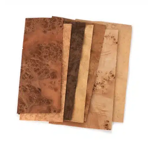
Furniture fronts, tops, and inlays
Burl veneer earns its keep on surfaces the eye lands on first. Doors, drawer fronts, table tops, fascia panels – anywhere a flat plane can act like a picture frame for that chaotic figure. One 2.6‑meter dining table top in walnut burl with a quiet solid edge will do more than an entire room of straight‑grain panels ever could. You let the burl carry the visual weight, and the surrounding components stay calm on purpose.
For casework, running burl veneer on just the fronts and a few feature panels keeps the material budget sane while still reading as “high custom” from three meters away. The carcass can be plain‑sawn walnut or even a stained secondary species; nobody’s checking the inside of the cabinet with a flashlight. On inlays, narrow bands of burl around a tabletop field or framed into door rails give you that “jewelry” effect without committing to full‑surface coverage. Think 40 mm rails and stiles in solid stock, with a 250 mm center panel in burl: the structure stays predictable, the face looks like you splurged.
It also bails you out when you have to deal with awkward proportions. A slightly too‑tall door suddenly feels intentional when the burl layout is mirrored and centered, because the figure becomes the focal geometry rather than the stile‑to‑rail ratio.
Automotive, yacht, and aircraft interiors
Burl veneer is almost shorthand for “luxury trim” in transport interiors. You see it in 7‑series dashboards, business jet side ledges, and yacht saloon tables for a reason: these are controlled environments with stable humidity and temperature, where the veneer is laminated over engineered cores and locked under high‑performance finishes. That combination lets you use fragile, high‑figure material without exposing it to the abuse a dining table in a busy household sees.
On a dashboard set, the game is all about matching. You’re often working with a single flitch to get the main dash, door caps, console, and sometimes rear tables to read as one continuous story, which is why shops will order 18–22% more burl veneer than the raw square footage suggests they need, just to maintain sequence and throw away leaves that break the flow. The substrate is usually a stable panel or molded composite, so you’re free to think in compound curves and tight radii that would be suicidal with solid burl.
Marine and aviation also make good use of darker burls – walnut, myrtle, amboyna – under high‑gloss polyester or polyurethane. Under that depth of finish, the “eyes” in the burl take on a three‑dimensional look that a camera struggles to capture, but anyone who’s run a hand across a yacht table in the afternoon light knows exactly why people pay for it.
Small goods that tolerate higher waste (boxes, instruments, décor)
Small format work is where burl veneer gets to be reckless. Boxes, watch winders, humidors, acoustic guitar headplates, amp cabinets, even 320 mm wall plaques – these all consume tiny pieces of veneer, so the high defect rate in a flitch hurts a lot less. You can cut around checks, bark inclusions, and weird color streaks, then pretend they were never there.
For luthiers and instrument builders, burl veneer is an accent, not a structural component. A maple burl headstock veneer under a clear nitrocellulose or poly finish adds personality without changing the way the neck behaves, and if one leaf blows out during routing, you’re out a few square centimeters, not an entire door front. Same logic for small décor: a set of eight coasters in mappa burl can be laid out from offcuts that would have gone to the bin after a larger project.
This is where you can be a bit playful. You can push bolder figure, stronger color contrast, and slightly wilder layouts, because the eye reads each object as a jewel, not as part of a huge, continuous surface where repetition and calm are more critical.
Is Burl Veneer Worth It for This Job?
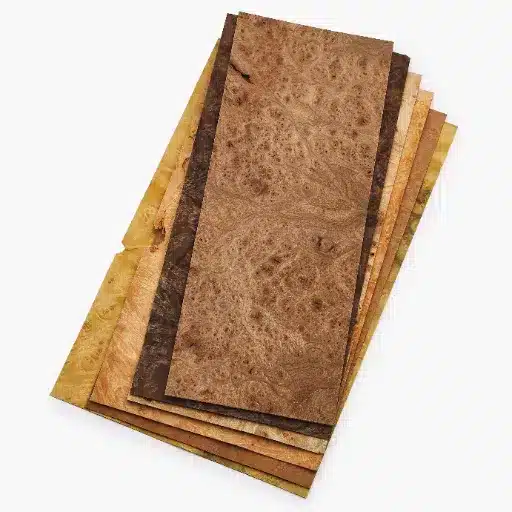
Comparing burl veneer vs figured veneer vs solid burl
Burl veneer sits in a different decision bucket than both figured veneer and solid burl. You’re not just choosing a nicer face; you’re choosing a different cost and risk profile. Figured veneer (curl, fiddleback, quilt) is usually cut from otherwise normal logs and sold at a premium, but it still behaves like veneer from predictable grain, with more stable yield and fewer structural surprises (see Oakwood Veneer’s figured vs burl overview, ref #1). Burl veneer is the opposite: rare, defect‑prone, visually explosive, and happiest when it’s the star of the show, not background texture.
Solid burl is another beast entirely. You’re paying for thick material that can be turned, carved, or machined – bowl blanks, table slabs, gun stocks – and that cost per board foot is often eye‑watering compared with the veneer pulled from equivalent burls. A 3‑foot walnut burl that might be sliced into many square meters of veneer can also be sold as a single turning blank in the four‑figure range if the figure is wild enough (a woodturner example in Northern Woodlands notes high‑dollar burls are often “car‑sized” to justify it, ref #2). For large, flat surfaces or panels, veneer almost always wins: you get the look of solid burl, laminated onto a stable substrate, at a fraction of the price and weight.
So the rough hierarchy looks like this: solid burl for sculptural or turned work where thickness matters, burl veneer for high‑impact faces and panel work, and figured veneer where you want movement and character but can’t justify the burl premium everywhere.
Budget math: yield, waste, and realistic cost per usable m²
The real question isn’t “What’s the price per sheet?” It’s “What’s my cost per usable square meter once I’ve cut around all the trouble?” Burl veneer throws that into sharp focus. High‑end paper‑backed mappa burl sheets in a 24″ x 96″ format can run around the mid‑hundreds of dollars for a single sheet in AA grade (one current listing is about $470.25 for 2′ x 8′, ref #3). In the same catalog or marketplace, a comparable size of conventional or composite veneer can land under $190, sometimes around $120–130 for rustic or planked looks (ref #3). That’s roughly a 2–4x multiplier before you even start trimming.
But yield is where the spread really shows. On a clean straight‑grain panel, you might plan for 5–8% waste – offcuts, minor defects, layout choices. With burl veneer, it’s entirely reasonable to budget 18–25% waste on a serious project, and I’ve seen builders pad it to 30% when they know they need tight book‑ or quad‑matching with minimal visible patches. Industry FAQs and supplier guidance are pretty blunt that burl veneer is “generally more expensive than standard wood veneer due to its scarcity and unique patterns” (see a typical wholesale supplier Q&A, ref #4), and that scarcity shows up as both higher sheet cost and lower recovery.
So when you’re running the numbers, don’t just compare line‑item pricing. For a 12 m² run of cabinet fronts or interior panels, you might price in 14.5–15 m² of burl veneer to protect layout options and defecting. That delta is where a lot of projects either stay on budget or suddenly start bleeding margin.
When to reserve burl for accents instead of full coverage
Burl veneer makes the most sense when it’s doing visible work. If the surface isn’t a focal point, burl is usually wasted there. So the decision often comes down to: does this project truly benefit from continuous burl, or can I get 90% of the impact by concentrating it?
On full‑coverage jobs – think a conference table, a yacht saloon table, or a statement wall – burl veneer earns its cost when the whole surface is read as a single composition and the lighting is good enough to reveal the depth. But if you’re doing a full kitchen, office fit‑out, or a suite of hotel rooms, it’s rare that running burl across every vertical face pays off. You usually get a cleaner look and saner budget by using burl on feature panels, door and drawer fronts, or a single hero element and letting straight‑grain or modest figured veneer carry the rest.
A simple rule that keeps clients happy: if you can’t immediately point to the surface from the room entrance and say “That’s where the money went,” you probably shouldn’t be using burl there. Reserve burl veneer for the places hands touch and eyes land – front edges of desks, center panels of doors, key sightlines – and your cost per wow‑moment drops dramatically. The offcuts can then feed smaller pieces like boxes or inlays, where high waste is just part of the fun instead of a painful line on the job cost sheet.
Handling and Applying Burl Veneer Without Cracks and Bubbles
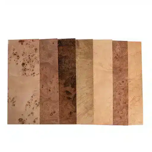
Flattening and conditioning wavy sheets
Burl veneer almost never arrives as perfect, obedient sheets. It comes cupped, rippled, and sometimes twisted enough that you can slide a 2 mm feeler gauge under the high spots without trying. That built‑in tension is exactly what turns into bubbles and hairline cracks if you try to press it “as is.”
So you start by relaxing it. A typical routine is a veneer softener or a home‑brew mix (water, a bit of alcohol, glycerin or similar humectant) misted lightly on the Burl Veneer face and back, then the sheet goes between absorbent papers and into a flat caul stack with moderate weight or in a non‑heated press. You’re not trying to crush it flat in one go. You’re letting the fibers equalize moisture and relieve some of those internal kinks while the papers swap out surface moisture in a controlled way. Swap the blotters when they pick up too much moisture, give it a rest cycle, then bring it back under pressure. On fragile burls with a lot of eyes, people will happily burn a day or two in this condition‑and‑rest loop because those 24 hours are cheaper than re‑doing a panel later.
On very wild sheets, it helps to pre‑trim to rough size before flattening, leaving 15–25 mm of sacrificial margin. That way you’re not fighting twist across the entire flitch when you only need one cabinet front out of it. Just don’t get greedy and cut to final dimension before you’ve seen how the sheet behaves after it relaxes.
Adhesive choices (UF, PVA, epoxy) and press options
Once the veneer lies reasonably flat, glue choice is the next trap. Burl has short, confused grain and lots of end‑grain exposure in those eyes, so it moves glue and moisture around differently than a straight‑grain face. Thin PVA with a long open time can work, but you have to watch for “cold flow” and spring‑back on larger panels; that’s where you press it, it looks good on day one, and 3 weeks later you see a soft bubble telegraphing between clamps.
For large, critical panels, a urea formaldehyde (UF) adhesive or other rigid resin glue in a uniform‑pressure setup (vacuum bag or platen press) is usually the safer call. The higher dimensional stability and lower creep help keep those little tension zones locked down once they’ve been flattened under pressure. If you’re doing demanding curves, odd substrates, or mixing species with very different movement, epoxy with a controlled spread can make sense, but it punishes sloppy prep – any void, dry spot, or contamination will show up as a dead area that refuses to bond properly.
Press choice matters as much as glue. A vacuum bag will happily conform to small irregularities in Burl Veneer and apply even pressure across the face, which is great for wavy sheets that never got perfectly textbook‑flat. A cold platen press with cauls gives you a consistent, predictable squeeze on flat work, but you need good caul prep and clean platens, because any trash or chip telegraphs through the veneer at these thicknesses. Hand‑rolling and clamping can work on really small workpieces – box lids, guitar headplates, inlays – but once you get past, say, a 300 × 600 mm panel, the risk of uneven pressure goes up fast.
One practical trick: on high‑risk burl, many shops keep spread rates on the conservative side and rely on the press for squeeze‑out, rather than slathering the panel. Too much liquid under a confused grain pattern is a good way to introduce localized swelling and later witness lines.
Edge treatment, seam hiding, and repair tricks
Edges and seams are where burl gives you away. The center of a panel can look perfect, but a chipped eye on the edge or a loud seam will scream “patch job” when the light hits. So you design your layout with escape routes. Run burl away from the most vulnerable edge, use solid lippings or thicker edge banding where you know there will be impacts, and keep your seams out of the direct sightline whenever you can.
For seams, tight‑joint ripping on a fine blade or shooting on a high‑angle plane gets you most of the way there, but the real magic is in pattern reading. You don’t just join two random leaves; you hunt for siblings where the swirl and color shift blend, even if it means a bit more waste. A 0.3 mm misalignment on straight grain is a faint line. On burl, a mismatched eye looks like a scar. On visible faces, consider bookmatching or slipmatching from the same area of the flitch so the seam becomes part of the pattern instead of a break in it.
Repairs are inevitable. Tiny voids and bark inclusions can be filled with clear or slightly tinted epoxy, leveled, and sanded; if you pre‑tint to the darker streaks in the burl, the repair often disappears under finish. For small blows or chips at edges, you can sometimes inlay micro‑patches cut from offcuts with matching figure, set on a slight bevel so the seam snakes along the grain instead of crossing it at 90°. It feels fussy, but when you’ve got a 1.9‑meter panel with one ugly chip right in the user’s eyeline, that 8 mm patch is worth every minute.
The last quiet trick is to plan your sanding like a conservator, not like you’re flattening a pine tabletop. Burl veneer has high and low density zones; if you let an aggressive random‑orbit sander sit a touch too long on the soft portion, you’ll dish it and ghost the pattern. Light passes, firm but not brutal backing pads, and a finish schedule that builds depth instead of relying on brute sanding will keep the surface intact – and your heart rate lower – when you finally lay on that first coat and see what you really built.
Finish Schedules That Make Burl “Pop” (Without Ruining It)
Dealing with end grain and blotch risk
Burl veneer finishes like very fancy end grain, even when the sheet looks “flat.” All those eyes and swirls are short grain and exposed pores, so anything thin and aggressive – dyes, hot oil, very wet stain – will dive in unevenly and leave you with dark halos and washed‑out patches instead of a clean gradient. It’s why one pass with a strong dye on mappa burl can make the eyes look like bruises.
So you treat Burl Veneer more like you’d treat a finicky soft hardwood: lock it down a bit before you try to make it pretty. A light washcoat of shellac (cut down to something in the 0.5–1 lb range) or a dedicated sanding sealer evens out uptake without completely killing chatoyance. You’re giving the thirsty spots a speed bump, not a brick wall. On burls with big color contrast – say, walnut burl with pale sap pockets – it’s often worth doing a test panel with and without that washcoat; you’ll see the difference in how much the stain or toner bunches around the eyes.
Blotch control starts long before any liquid hits the surface. If you sand through veneer peaks into softer areas around the eyes, those zones drink more finish and telegraph as dull spots later. Keep your sanding uniform, be suspicious of aggressive grits on a random‑orbit sander, and don’t chase every microscopic scratch in the raw surface; most of what scares you at P180 disappears under the first sealer coat.
Sealers, pore fillers, and topcoats that play nicely with burl
The finish schedule that makes burl pop is usually layered and a bit patient. One‑and‑done products tend to either sit dead on the surface or hammer the figure so hard it looks fake. A classic approach is: washcoat, pore fill if needed, then a clear film that builds depth without turning amber too fast.
On open‑pored burls (walnut, some maples, myrtle), a clear or slightly tinted pore filler gives you that glass‑flat feel without having to bury the surface under 19 coats of topcoat. You can apply filler after the sealer coat so it doesn’t stain the surrounding lighter zones too aggressively, then scrape or wipe back to keep the figure crisp. If you want warmth, a tiny bit of dye in the filler or the first couple of clear coats usually looks more controlled than slamming a heavy stain into raw veneer.
For the film itself, you pick based on use and look. Hard‑use horizontal surfaces – tables, desktops, bar tops – do well with 2K polyurethanes or catalyzed varnishes that build a tough, clear film and resist the kind of abuse that would chew through softer finishes. For vertical panels and cabinetry, high‑quality pre‑cat lacquer or waterborne poly works, especially if you want to keep color shift minimal over time. On high‑gloss automotive or marine‑style burl, people often stack several medium coats with level‑sand steps in between so the eyes look like they’re floating under a few millimeters of glass rather than painted on.
You can sneak in a little color shaping with toners or very light dye in the early coats if the burl needs help – say, cooling off an overly orange maple burl or warming a slightly gray walnut. Just keep it honest; once you bury the natural variation under too much color, it starts to look like printed foil.
Whatever schedule you choose, the non‑negotiable is test pieces. Offcuts from the same Burl Veneer, same substrate, same glue line. Run your whole system on those, right down to the final sheen, before you commit to the big panel. It’s the cheapest insurance you’ll ever buy, and you only have to wreck one 220 × 280 mm test board to remind yourself why.
Frequently Asked Questions (FAQ)
-
Is burl veneer too fragile for a dining table top?
Not if you build the stack correctly. Use burl veneer over stable MDF or birch ply, a rigid glue line (UF or 2K), then a hard film finish like 2K poly. I’d still add a 3–4 mm solid edge for protection. In a family that uses trivets and doesn’t drag cast‑iron pans across the surface, it holds up surprisingly well. -
Can I bookmatch burl veneer on cabinet doors without it looking chaotic?
Yes, but you have to be picky with the flitch. Lay out 6–8 consecutive leaves on the bench and mark the most “calm” center area for pairs. Bookmatch those for the middle doors and use slightly wilder areas for end units. On a 600 mm wide door, even a tight, center‑focused bookmatch reads organized, not noisy. -
What’s a good finish for burl veneer on a guitar headstock?
Think thin and clear. A couple of light shellac seal coats, then a compatible nitro or poly system works well. On something like maple burl over a mahogany neck, I’ll flood the first clear coat just enough to wet the figure, then build 5–7 very thin coats. You want depth and gloss without burying the crispness of the eyes. -
How do I stop burl veneer seams from standing out on a long panel?
Start with tight‑joint ripping or shooting so the gap is basically invisible dry. Then pay attention to pattern, not just straight edges: slide leaves until the swirls and color flows line up, even if that wastes 20–30 mm. On a 2.4 m hallway panel, keeping seams out of the center 600 mm band also helps; people rarely study the edges. -
Is burl veneer a bad idea in a small room, like a home office?
It can overwhelm the space if you use it everywhere. In a 3 × 3.5 m office, I’d keep burl to the desktop and maybe one feature cabinet, then run straight‑grain or rift veneer on the rest. That single burl surface right under task lighting looks intentional, while a full burl wall of doors would feel busy and slightly dated.
References
-
JoeWoodworker. (1999). The JoeWoodworker Guide to Veneer Figure, Methods, and Options. https://www.joewoodworker.com/veneering/why-use-veneer.htm
-
AHC Hardwood Group. (2019). Veneer Technical Guide (KPPS_AH_112). https://www.hardwoodweb.com/wp-content/uploads/2019/11/Veneer-Technical-Guide.pdf
-
Northern Woodlands. (2019). Burlwood. https://northernwoodlands.org/articles/article/burlwood